
Budgets can be hard to understand without expert knowledge, making it difficult to establish how much has been allocated to health. Visualisation tools can make this easier, by transforming budget figures into easily-understandable graphs and figures.
Budgets can be hard to understand without expert knowledge, making it difficult to establish how much has been allocated to health.Visualisation tools can make this easier, by transforming budget figures into easily-understandable graphs and figures.See our collection below:
- NIGERIA, 2013 and 2014, mostly static visualisations, by BudgIT
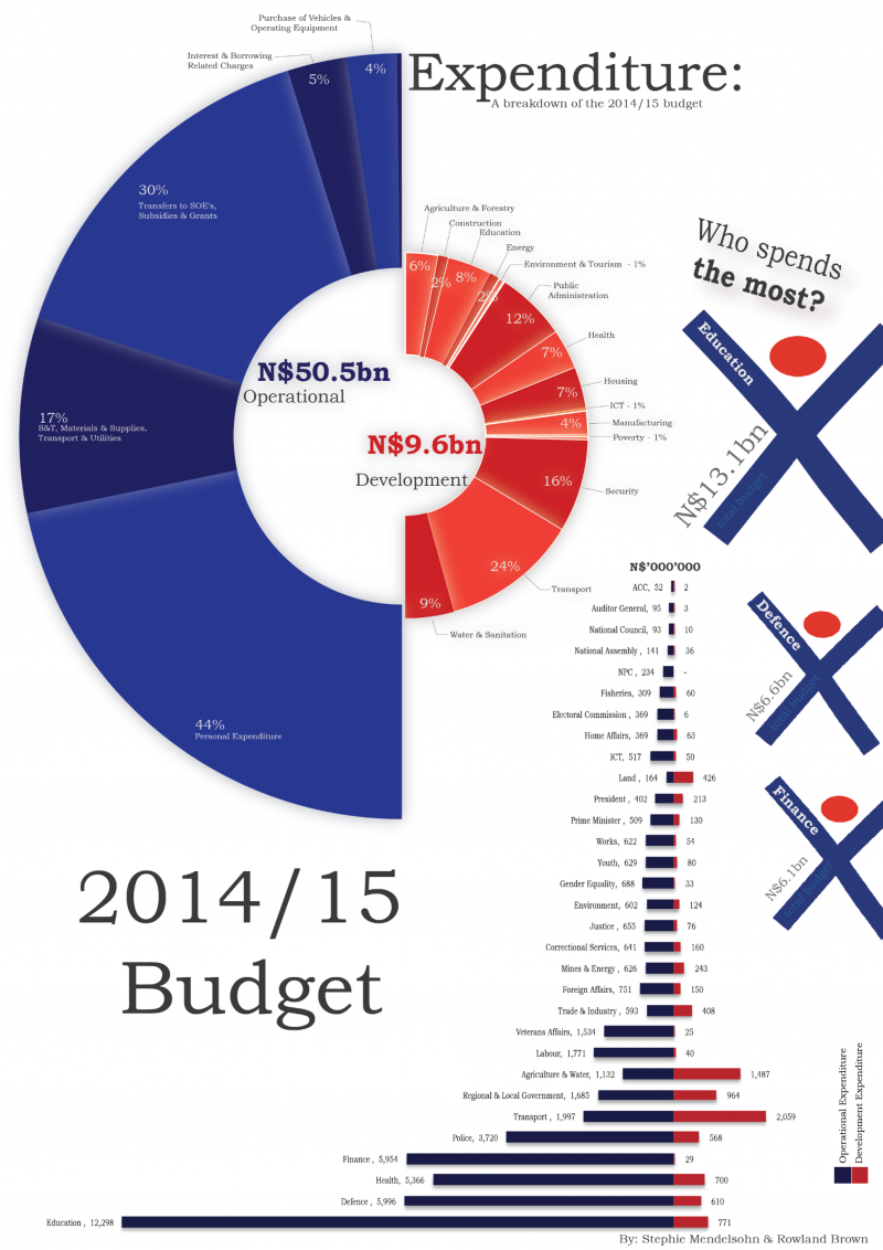
- NAMIBIA, 2015, static visualisation, by Statistically Insignificant
- SOUTH AFRICA, 2012 and 2013, static visualisation, by Siyabonga
- UGANDA, 1998 to 2015, interactive tool, by Uganda MOFPED
- GLOBAL, mixed periods, interactive tool, by Open Spending – includes budget information for: Burkina Faso, Cameroon, Kenya, Nigeria, Senegal, Sierra Leone, South Africa, Tanzania, Uganda, Zimbabwe. You can upload your own budget data for visualisation too!
- KENYA, 2003 to 2011, interactive tool, by Twaweza
- TANZANIA, 2008 to 2011, interactive tool, by Twaweza
Many of these need updating based on the latest budget information, or further work to make them more understandable. Calling on volunteers!Have we missed out your favourite visualisation tool? Let us know at ahbn@evidence4action.net.